Hybrid
Branddesign
Packagedesign
Concept
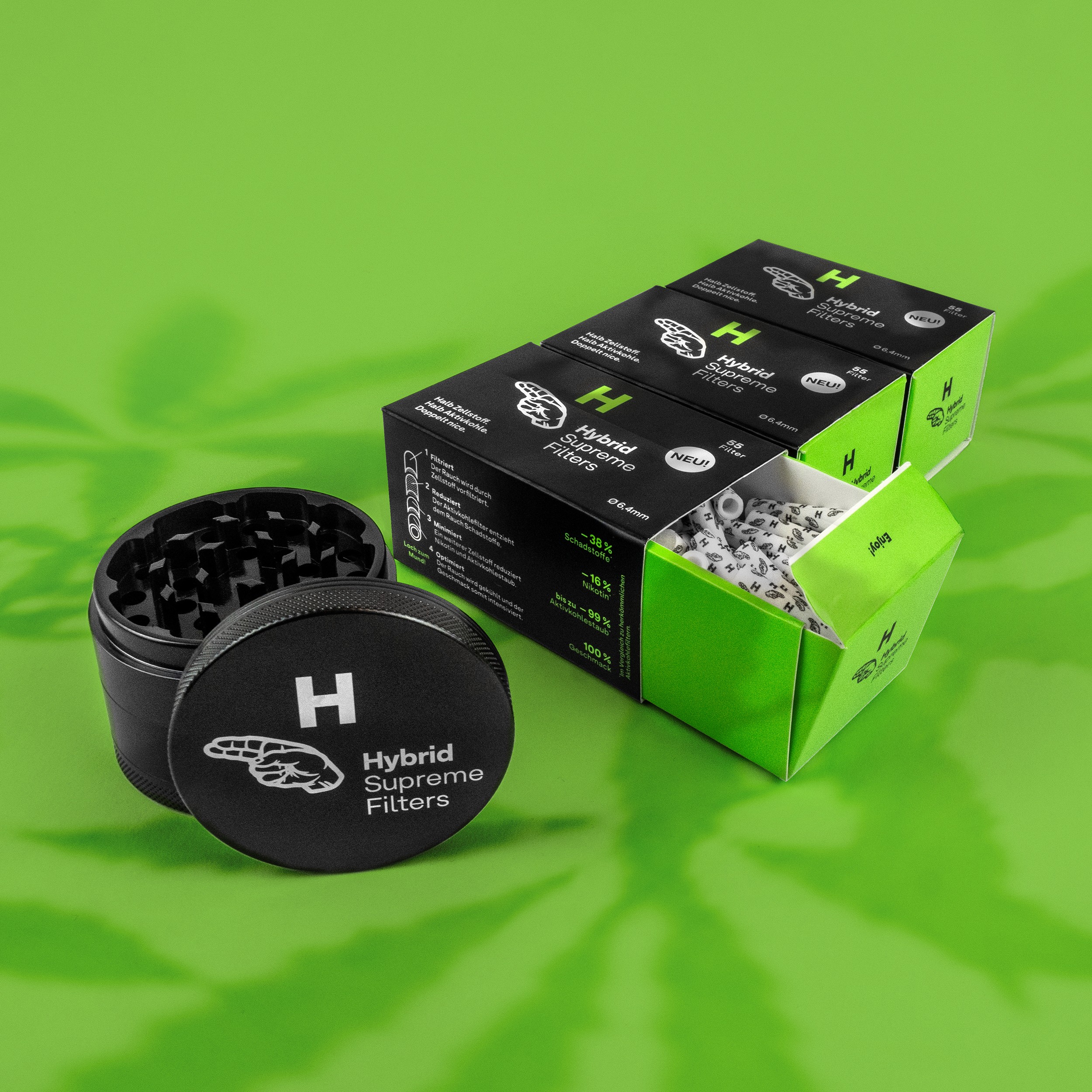
In 2020 Ulrich Fuchs (our studiodual.eu) and I created the Brand- and package design for Hybrid Supreme Filters. A new kind of combined filter the cannabis-community hasn’t seen yet. The design positions the brand as a fresh and unadapted product with a fact-driven, scientific side. Hybrid Supreme Filters reflects an urban lifestyle. Like its community and the filters inventors.
Since their launch in 2020 Hybrid Supreme Filters have become a more than successful player on the market of actived carbon filters.
The Logo
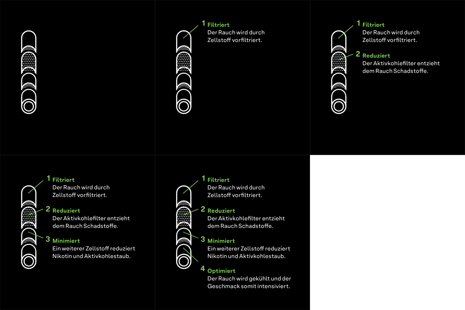
Hybrid <high-breed>, as it’s in the name already, is the combination of different things creating a new, even better thing. For instance: Cellulose filters and activated carbon. Technology and Lifestyle. Hybrid has its origins in science, but also lives in the streets.
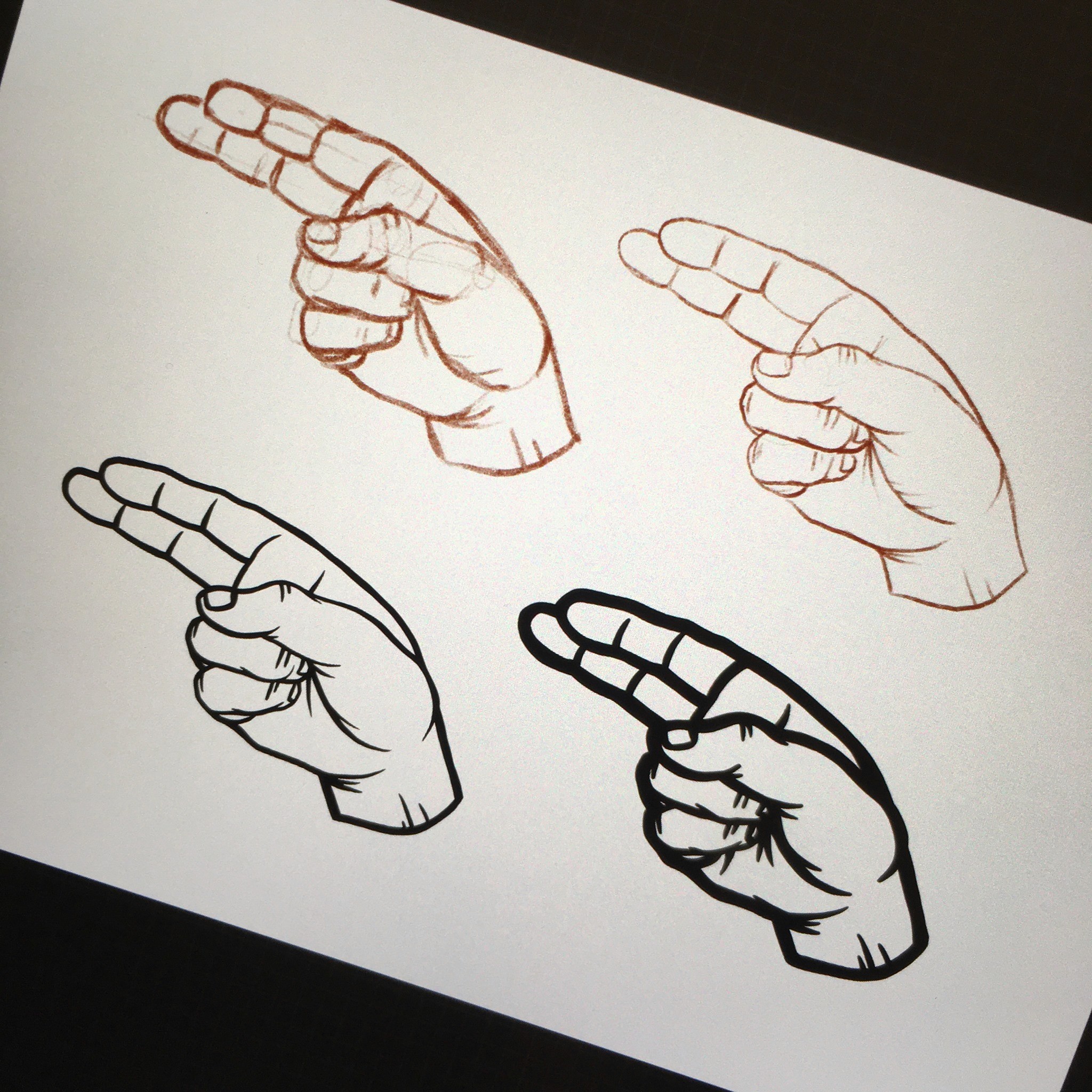
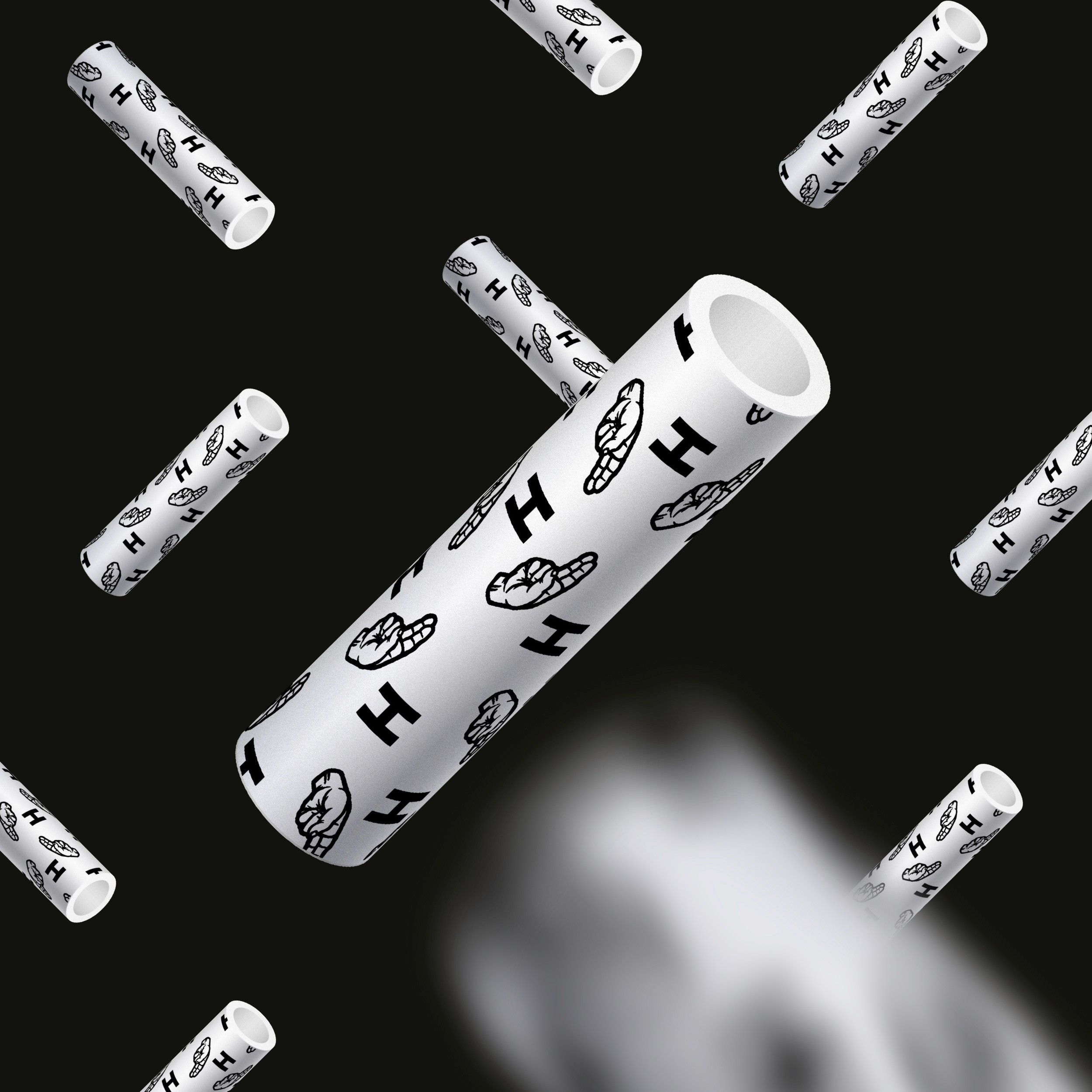
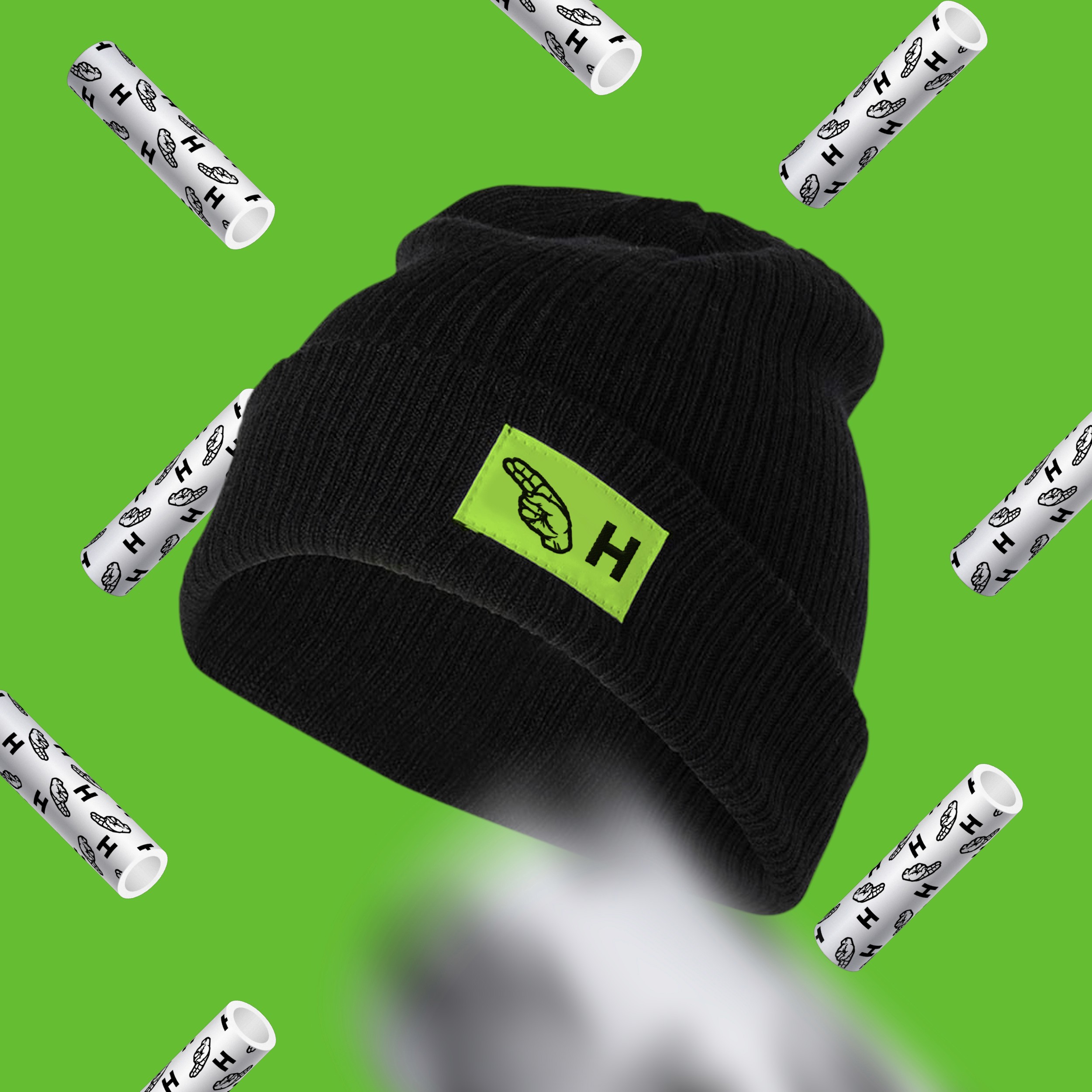
This is why the hand-sign communicates several things:
-
It’s a secret gang symbol
-
It’s the „H“ in sign language (+ we got a lot of positive feedback on using sign language in marketing)
-
How do you smoke your spliff? – Exactly!
Packaging
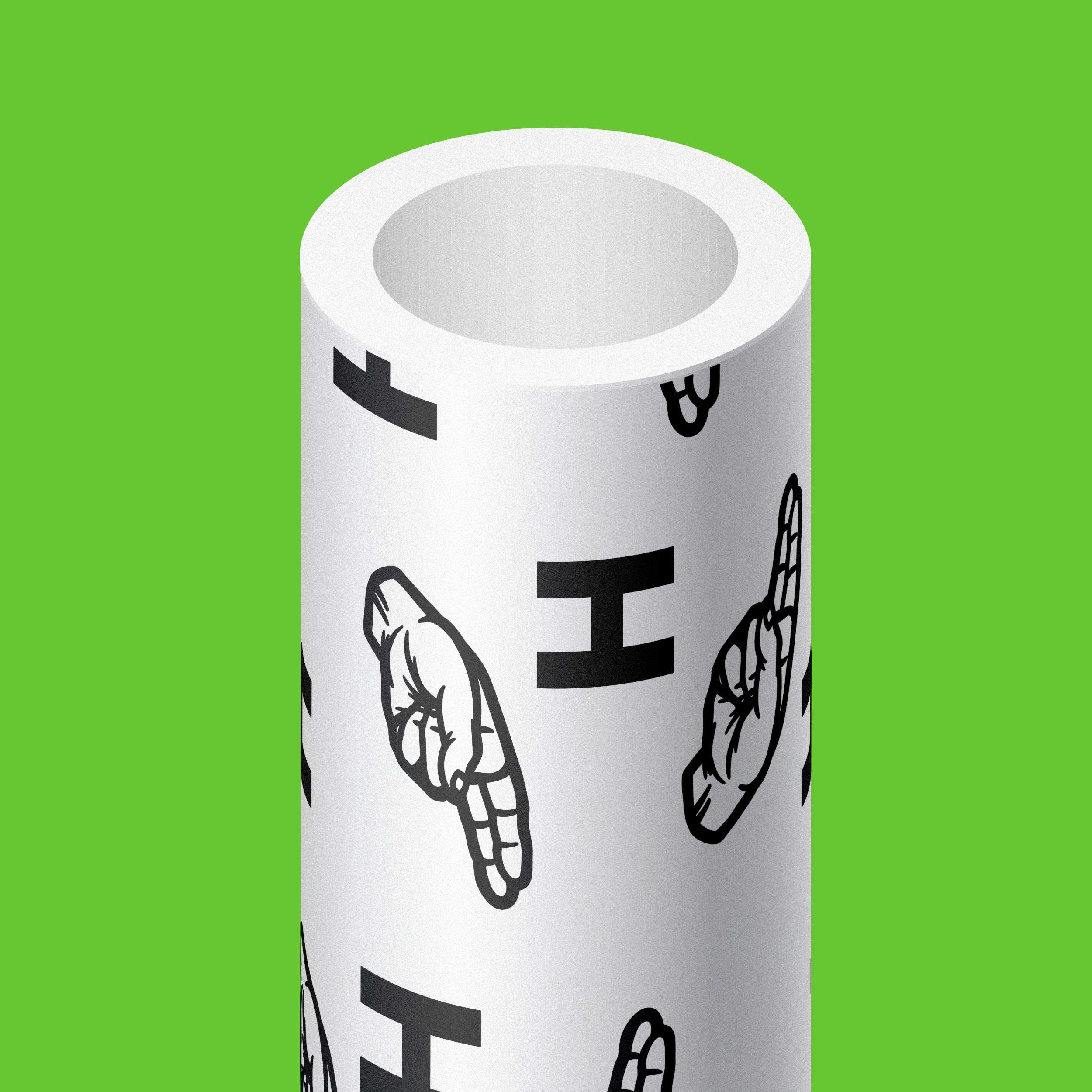
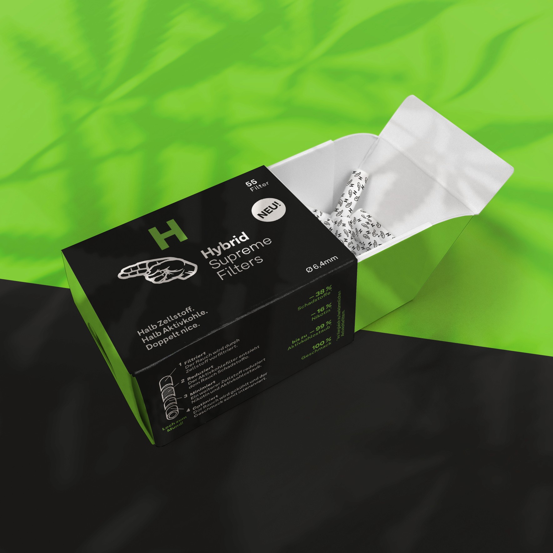
What’s important about shelf-packaging? – Catching the eye of a customer at their favourite headshop! And second, readability is super important. – Hybrid Supreme Filters packaging has a striking, clear and bright design language. It’s a cross between reduction to what’s important and flashy, lively colours. Julia Wöhrer did an awesome job developing brand language, claim and their headline concept: „Half cellulose. Half activated carbon. Twice as nice.“
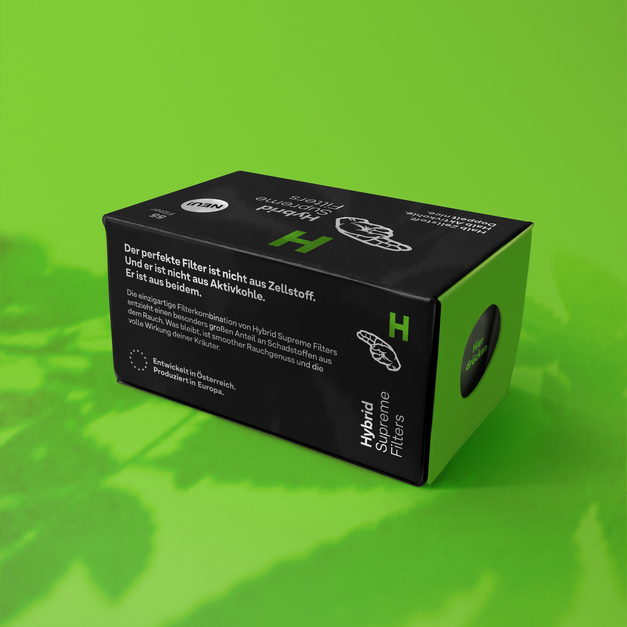
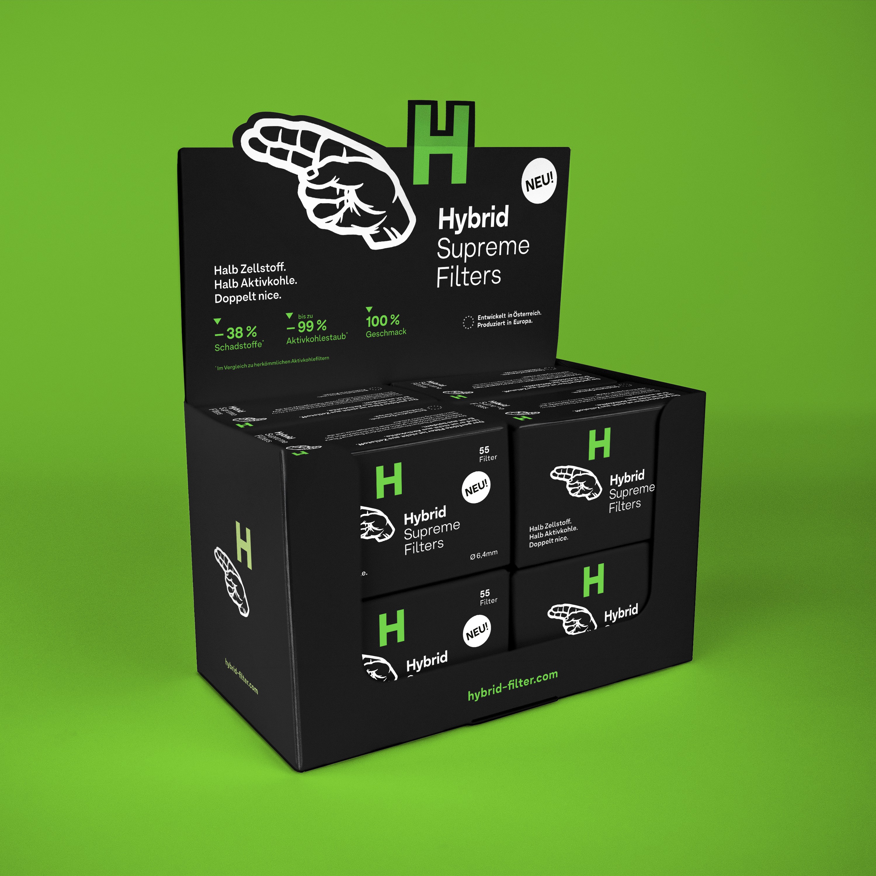
Impact
By designing Hybrids initial products, we were able to set the brand's design vibe. This will continue to shape their growing product range and ongoing business-journey.
Since then Hybrid has evolved into a serious international player. It grew into a love brand. So much a fan had the Hybrid hand tattooed on his back.
Client: Hybrid Supreme Filters
Text Concept: Julia Wöhrer